Antares
Antares Capital required a refined brand identity that accurately reflects its position as a leading private credit platform.

CLIENT
Antares
SERVICE PROVIDED
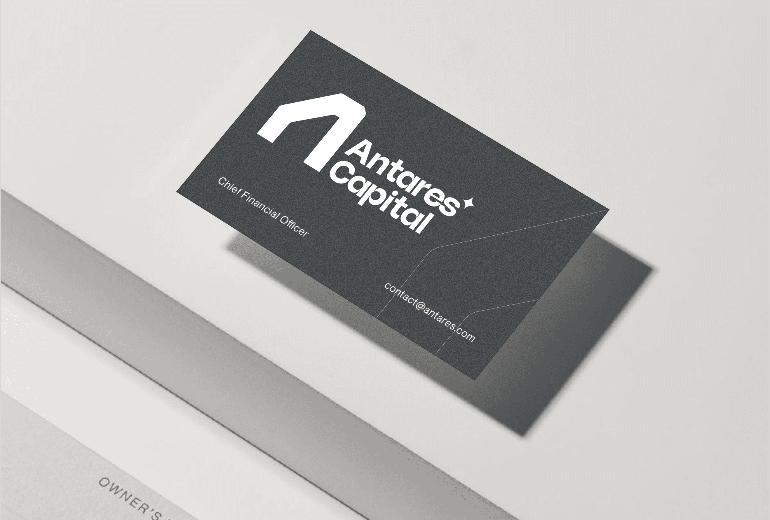
Brand Identtiy and Guidelines
TIMELINE
4 Weeks
The Challenge
Antares Capital required a refined brand identity that accurately reflects its position as a leading private credit platform. The existing visual language did not fully communicate the firm’s institutional strength, disciplined investment philosophy, and long-term capital leadership.
The challenge was to evolve the identity into something more structured, authoritative, and globally aligned — without losing credibility or appearing trend-driven within a highly conservative financial sector.

The Solution
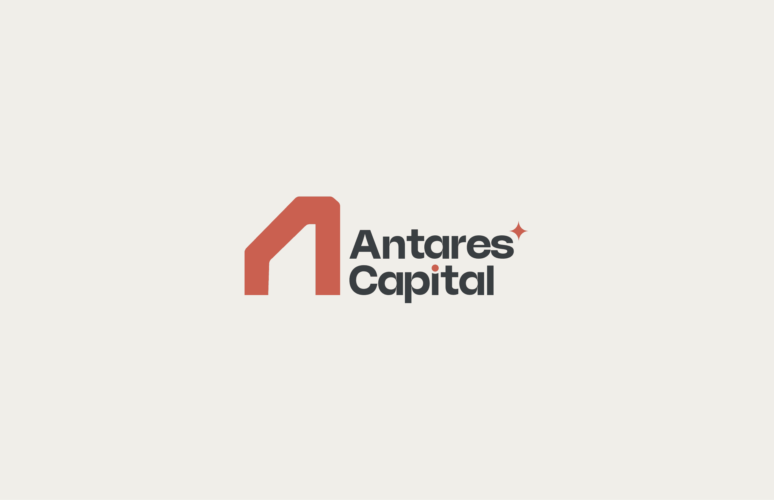
We developed a minimalist, architectural icon built on geometric precision and structural clarity.
The new mark embodies:
Stability through grounded form
Discipline through sharp, intentional angles
Direction through subtle forward momentum
The visual system prioritizes deep institutional tones, strong typography, and restrained color use to reinforce authority and trust. The result is a timeless, confident identity aligned with private credit and institutional finance.


Results & Impact
Strengthened institutional perception
Elevated brand authority across digital and investor materials
Clearer alignment between visual identity and investment philosophy
Improved consistency across presentations, reports, and marketing assets
The refined identity positions Antares as a disciplined, strategic capital partner in the global private credit market.
Client Review
“The new identity reflects exactly who we are — disciplined, stable, and forward-thinking. The refined mark captures our institutional strength while presenting a more modern and confident presence across all platforms.”
— Antares


